
Walk past a coffee accessories display from five years ago and then a current one, and the direction is obvious even before reading a single price tag. Fewer printed graphics, fewer colours competing on the same shelf, fewer features announced in text on the packaging. What replaced them is quiet: clean silhouettes, matte surfaces, restrained colour, and tools that look like they were designed rather than decorated.

This is not an aesthetic fashion happening in isolation. It tracks changes in how people buy, photograph and keep tools – and for brands planning a range, those practical pressures explain why restraint keeps winning shelf space.
Tools now live permanently on camera
The single biggest change is that every kitchen tool gets photographed. A grinder sits in the background of a morning video; a canister appears in shelf photos; a tamper appears on a counter post. Products that read clearly in a photograph – one recognisable shape, one coherent finish – do better than busy ones, because complexity turns to noise at small sizes.
This has quietly reversed an old rule. Detail used to signal value (“look at all these features”). Now restraint signals value, because anyone can add detail and very few people can remove it well.
Minimal tools look appropriate in more homes
Coffee equipment moved out of the utility cupboard permanently. Anything visible every day has to coexist with the room, and that changes what sells: a matte black distributor disappears comfortably into most kitchens, while a bright multi-colour printed handle dictates the surroundings.
This is also why neutral metallics – stainless, soft blacks, muted greens or greys – travel better across markets. A single design language can be sold in Europe, the Middle East and Southeast Asia without reworking artwork for each, which matters more than it sounds when MOQs are being set.
Restraint reads as honest
There is a trust element that has nothing to do with looks. A tool with no visible gimmicks implies that the thing it does, it does properly – the cost went into the burr, the seal, the needle rather than into a decorative element that will wear off.
Buyers have been burned by this. Printed finishes that peel after a dishwasher cycle, coloured handles that fade, “features” that turn out to be moulded plastic. Once a category has a reputation for that, simplification becomes a credibility signal, and credibility sells.
What brands can actually do with minimal design
The obvious worry is: if everything is quiet, how do you differentiate? Four levers remain, and they are the ones most worth spending time on:
Silhouette. Proportion, neck taper, handle angle. Two visually simple tools are still instantly distinguishable if their shapes differ. This is where industrial design earns its cost because competitors cannot copy it cheaply.
Finish. Matte, satin, mirror, or a sprayed or baked colour applied consistently across a range. Finish is how a quiet product carries identity without graphic noise – and it is how a brand makes five tools look like one family.
Tactile quality. Weight, balance, how a lid seats, how a collar turns. Nobody photographs this, everybody feels it, and it drives repeat purchase more than almost anything visible.
Packaging restraint. A minimal tool in loud packaging is a contradiction. Where budget allows, letting the packaging be equally quiet – materials, texture, typography – completes the impression.
Where minimalism goes wrong
Three failure modes are common enough to plan against. First, minimal becoming anonymous: if removing everything leaves no recognisable identity, the product becomes easy to substitute and price becomes the only comparison left. Keep one deliberate element.
Second, minimal used to hide cost-cutting. Stripping detail should not mean thinner walls or a cheaper burr; customers discover this quickly and it damages the whole range rather than one SKU.
Third, minimal everywhere at once. A catalogue where every item is the same matte black cylinder loses sales to customers who want one piece that stands out. A range needs an anchor, and usually a hero finish.
What this means when planning a range
Decide the design language before selecting individual products, then hold every item to it – including the ones sourced later, and including packaging. It is far easier to approve pieces against a single rule (“this shape family, this finish set”) than to assemble attractive individual items and discover afterwards that they do not look related.
That decision also protects future ranges. A coherent language can be extended – a new size, a new tool – without redesigning the whole line, which is precisely the advantage the quiet approach offers over decorative trend cycles that expire in a season. It is also the pattern behind the accessories that keep selling year after year, covered in our notes on what moves in this category.
Frequently asked questions
Does minimal design cost more to produce?
Not inherently. Simple shapes are often easier to tool. What costs more is precision: plain surfaces and tight tolerances leave nowhere to hide a defect, so finishing and inspection standards have to rise to match the look.
How do you keep a minimal range from looking generic?
Keep one deliberate signature – a proportion, a finish, a detail repeated across every piece. Something recognisable in a photograph at thumbnail size is what makes the range yours rather than merely simple.
Will the minimal trend last?
The drivers behind it – photographed kitchens, tools permanently out on counters, buyers wary of decorative gimmicks – are structural rather than seasonal. Specific colours will rotate; the preference for restraint has more durable reasons behind it.
Quiet, unbranded-looking tools


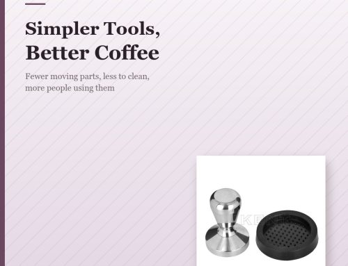
Browse the full Coffee Tamper Distribution range for sizes, finishes and OEM options.
Let’s Build Something Together
The coffee world keeps demanding quality, functional accessories. Partner with iKentcoffee to offer tools that perform and represent your brand proudly. From manual coffee grinders, espresso tampers and coffee canisters to milk pitchers and full coffee sets — we provide OEM & ODM solutions with low MOQ and stable supply.
👉 Contact us today to discuss wholesale, customization, or to request a sample.
💭 Jiangmen Aika Houseware Co., LTD
💭 Jiangmen Zhenhua Hardware & Plastic Factory
We look forward to the opportunity to collaborate with you!
WhatsApp: +86 13426845305
E-mail: kaelyn@ikentcoffee.com
Website: www.ikentcoffee.com

Leave A Comment